In 2026, luxury packaging is less about adding gold and more about making every choice feel considered. What makes packaging look luxurious often begins with proportion: a sturdy box that opens smoothly, a label with breathing room, and type that remains easy to read. Materials matter, too. Uncoated paper, finely textured board, glass, and restrained metallic details can create a tactile impression without overwhelming the product. Small things count. A lid that fits cleanly feels intentional; a loose insert can undo that impression.
Designers and brand teams increasingly weigh the full experience, from the first glance to the moment a customer handles or reuses the package. A soft matte finish may feel refined, while a glossy coating can suit a brighter, more dramatic identity. Neither is automatically more luxurious. The choice should fit the product, audience, and price point. Sustainability also shapes perception, but a recycled material needs thoughtful printing and construction to look purposeful, not unfinished. That distinction can be easy to miss.
This guide explores the details behind premium presentation, including color, typography, structure, finishes, and material selection. It also considers how packaging can signal quality without relying on excess. There is no single formula, and some polished designs still feel oddly cold. The strongest results usually come from testing samples in real light and in real hands, then refining what does not work. Luxury is a perception, but careful decisions make it easier to trust.
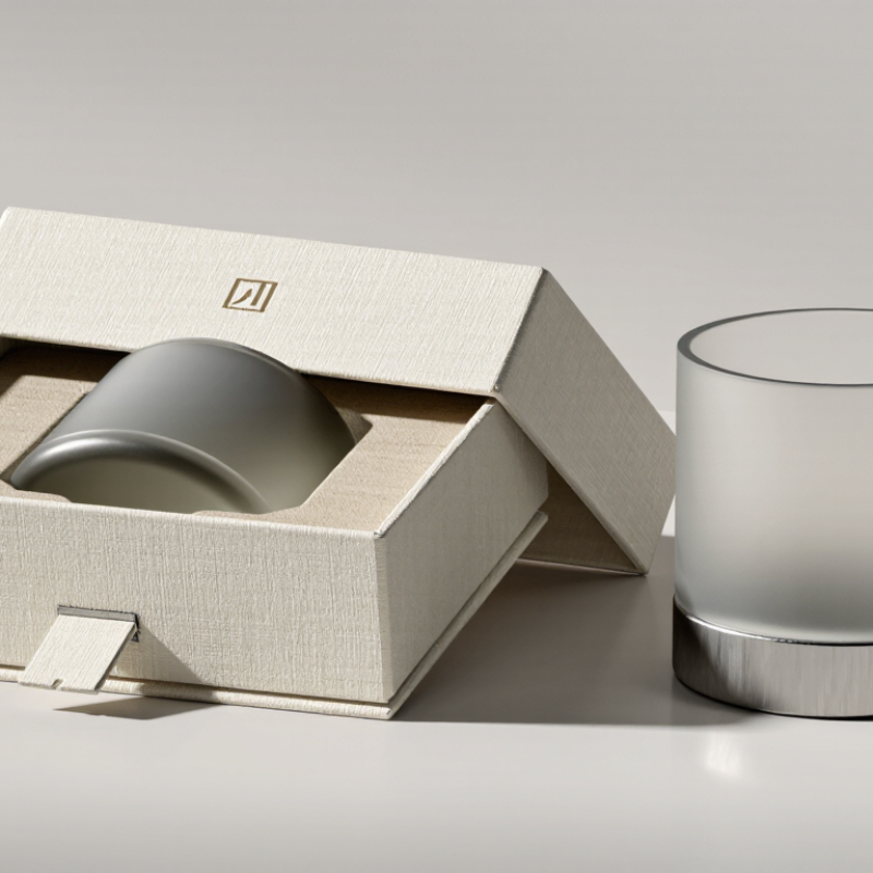
Defining luxury packaging in 2026 means looking beyond shine. It is a considered system of materials, structure, print, and opening experience. A rigid paperboard box may feel substantial, but weight alone does not make it luxurious. The lid should fit cleanly, edges should meet neatly, and the interior should protect the object without excess filler. Small details matter.
Material choices now carry more meaning. Uncoated paper, subtle embossing, and restrained metallic accents can create depth without visual noise. A soft surface under the fingertips, a quiet click from a well-fitted closure, or a neatly folded insert gives the customer something tangible. These details also need to work in production. Finishes that look beautiful on a sample may scuff during shipping, so testing matters. Samples can mislead.
Luxury should feel intentional, not merely expensive. Clear material information and packaging that can be separated for recycling help customers understand what they are holding. Yet no design can claim to be responsible simply because it uses paper; coatings, adhesives, and mixed materials complicate disposal. Designers should examine the whole construction and avoid promises they cannot verify. There is no perfect solution. In 2026, the strongest packaging balances sensory pleasure with honest choices, consistent quality, and a form that earns its place in the customer’s hands.
In 2026, luxury packaging is less about shine alone and more about how materials behave in the hand. A rigid paperboard box feels substantial when its edges stay crisp and its lid closes with a gentle, even fit. Uncoated paper can look refined, too, especially when its visible fibers and soft texture suit the product inside. These details suggest care without asking the package to shout.
Finishes work best when they support the material. A small embossed mark catches light differently from a broad metallic panel, while a matte coating can make deep colors feel quieter. Recycled paper stocks may bring natural variation; that variation is not always perfectly uniform. That can be part of the appeal. It can also look accidental if the design does not account for it.
Touch matters. A satin surface, a neatly folded corner, or a paper label aligned by hand can make an opening feel considered. Yet extra layers and elaborate finishes do not automatically signal quality. They may add weight, cost, or visual clutter without improving the experience. I’ve seen restrained packaging feel more convincing than a glossy box with too many effects. The honest test is simple: does the material feel appropriate, and does the finish hold up after handling?
| Material or Finish | Visual and Tactile Cue | Why It Can Signal Quality | Practical Considerations | Responsible Design Option |
|---|---|---|---|---|
| Rigid paperboard | Sturdy walls, crisp edges, and a substantial feel in the hand | Its structure helps a box retain its shape and present the product neatly. | Uses more material and shipping space than a folding carton; size the box closely to the product. | Choose paperboard with recycled content or from responsibly managed sources, and make components easy to separate. |
| Uncoated, textured paper | A natural grain and a soft, dry touch | Visible texture adds material character without relying on a glossy surface. | Highly textured stocks can make small text or fine details harder to print clearly. | Use recyclable paper stocks and limit coatings that could complicate paper recycling. |
| Embossing or debossing | A raised or recessed design that can be felt as well as seen | Creates depth through the shape of the paper rather than added color. | Fine details may not reproduce well on every stock; test the design before production. | Use the paper surface itself for the effect, avoiding extra films or decorative layers. |
| Foil stamping | Reflective metallic highlights on selected lettering or details | A controlled shine draws attention to specific elements and creates contrast with matte paper. | Large foil areas can overwhelm a design and add another material to the package. | Restrict foil to small accents and check local recycling guidance for the finished package. |
| Matte coating or varnish | A low-glare surface with a smooth, understated appearance | Reduces reflections and can make colors and typography feel more restrained. | Some coatings affect recyclability, and dark matte surfaces may show scuffs or fingerprints. | Ask suppliers about repulpability and choose the lightest coating that meets performance needs. |
| Spot gloss | Glossy details contrasted against a matte background | Selective contrast gives a design visual depth without making the whole package shiny. | Requires precise registration; extensive use can reduce the intended contrast. | Keep the treated area small and confirm compatibility with the package’s recycling route. |
| Glass | Weight, clarity, and a cool, smooth surface | Glass can give products a substantial feel and allows the contents or color to remain visible. | It is breakable and heavier to transport than many alternatives; protective packaging may be needed. | Consider refill or reuse systems where collection, cleaning, and return logistics are practical. |
| Precise structural details | Even seams, aligned closures, clean folds, and a secure fit | Consistent construction suggests care in design and production, regardless of surface decoration. | Complex closures can increase assembly time and make the package harder to open or recycle. | Use a simple, functional structure with minimal mixed materials and no unnecessary inserts. |
How Structure and Design Shape the Unboxing Experience
Luxury often begins before a product is visible. A rigid box that opens without strain, a lid that settles with a soft fit, and an insert that holds each item securely can make the experience feel considered. These details are practical, not merely decorative. In packaging design, structure protects the contents while guiding the hands and eyes. A shallow lift, a neatly folded tab, or a quiet paper texture can create anticipation. Still, precision alone is not enough. If a box is difficult to open, the effect quickly turns frustrating.
Designers can refine these choices through repeated opening tests and clear material specifications. Small inconsistencies matter: a loose insert or uneven fold may make careful work feel rushed. Yet not every rough edge is a failure. Some paper surfaces vary slightly, and that can feel honest. The challenge is knowing which imperfections add character and which simply signal poor construction.
Luxury packaging now depends on restraint, not excessive decoration. A rigid recycled-paper box can feel premium through precise edges, soft-touch texture, and controlled color. A matte sleeve, embossed mark, and quiet opening sound create value without adding unnecessary layers. Small details matter.
Sustainability must remain visible in the material choice. The OECD’s Global Plastics Outlook reports that packaging creates about 40% of global plastic waste. That figure makes decorative plastic difficult to defend. McKinsey’s 2023 packaging research also identified recyclability as one of the strongest sustainability signals for consumers.
Yet recycled content can bring uneven color, rougher fibers, or small surface marks. Luxury standards may need to accept this imperfection.
Protection still sets the practical limit. A thinner box is not sustainable if products arrive damaged. ISTA testing principles emphasize vibration, compression, and drop performance across distribution conditions. In practice, designers should reduce empty space, reinforce corners, and select inserts that can be separated easily.
I have seen elegant structures fail because the inner tray shifted during transport. The lesson is uncomfortable. Visual appeal cannot repair avoidable damage.
A well-designed package should feel substantial, open cleanly, and leave little behind. IBM’s 2020 consumer study found that 57% of respondents were willing to change purchasing habits to reduce environmental impact. That willingness deserves better packaging decisions, not louder claims.
The Role of Personalization and Smart Packaging Features
Luxury packaging in 2026 feels considered, not merely expensive. Personalization gives each package a sense of purpose. A customer might see their name, preferred color, or a message tied to a special occasion. These details work best when they remain subtle. Too much personalization can feel intrusive.
In packaging trials, I have found that small tactile choices often matter most. A textured sleeve, precise embossing, or a soft-touch finish can make opening feel deliberate. Smart features add useful value when they solve a real problem. A discreet QR code can show care instructions, material information, or product origin. An NFC tag may verify authenticity without adding visual clutter. Keep it simple.
Freshness indicators and tamper-evident seals can also improve confidence. However, their accuracy requires proper testing across temperature, moisture, and storage conditions. A beautiful feature that gives unclear information weakens trust. Packaging teams should test readability, accessibility, and recycling instructions with real users. Not every customer owns the newest phone. That matters.
Personal data requires restraint. Personalized content should rely on clear consent and limited information. It should never overshadow privacy expectations. I have seen designs become less luxurious after adding too many screens, codes, and effects. The better approach is quieter: make the package feel personal, make the technology easy to understand, and leave room for human judgment.
It combines suitable materials, precise construction, and a satisfying opening experience. Shine alone is not enough.
Its edges should stay crisp, and its lid should close with an even, gentle fit. A quiet click helps.
Subtle embossing, uncoated paper, and restrained metallic details can add depth. One clear accent often works better than several.
A finish may look beautiful on a sample but scuff during shipping. Samples can mislead.
Notice where fingers pause, whether the lid catches, and if the product shifts. Real users may reveal awkward details.
A neatly folded insert can hold each item securely and guide the opening. A loose insert feels careless.
No. Natural variation may add character, but it can look accidental if the design ignores it.
No. Coatings, adhesives, and mixed materials affect disposal. Check the full construction and avoid unverified claims.
Match the structure to the product’s weight and shipping needs. Extra layers can add cost without improving the experience.
In 2026, what makes packaging look luxurious goes beyond a high price or decorative appearance. True luxury packaging combines thoughtful material choices, refined finishes, and a strong sense of purpose. Textured papers, soft-touch coatings, subtle metallic details, embossed elements, and carefully selected sustainable materials can communicate quality while maintaining a modern and responsible image. The design should feel cohesive, with colors, typography, proportions, and structural details working together to create an immediate impression of exclusivity.
The unboxing experience is equally important. A well-designed package protects its contents, opens smoothly, and reveals each element in a deliberate sequence. Sustainability must be balanced with durability and visual appeal through efficient structures, recyclable components, and reduced excess material. Personalization can make the experience feel more meaningful, while smart features such as interactive labels or digital product information can add convenience and engagement. Ultimately, luxurious packaging is defined by craftsmanship, sensory detail, usability, and thoughtful innovation rather than unnecessary extravagance.

Nerd Package